Filed under: Branding, Design, Uncategorized | Tags: advertising, design, graphic design
It’s easy to look at a logo or a brochure layout that appears to be very simple and conclude that did not take much time to design. That conclusion is very far from reality. Graphic designers follow a methodical design process, and every step of that process requires time to complete.
Designers need to research, ask questions, formulate a creative brief that guides them to developing a solid final design. After the brief is established, a bulk of our time goes into creating ideas and concepts. Depending on the number of rounds of revisions, the refinement phase may require additional time. Stronger concepts are refined until the final design is approved. The design process applies to everything from logos to web sites and requires several weeks to several months depending on the scope of the project.
Other aspects of design can be time-intensive. A layout of a document like a brochure, a newsletter or a magazine spread is more than copying and pasting text from a Word document. There needs to be time allowed for typesetting to optimize readability, for formatting to create consistent appearance, and for proofreading so that the message isn’t compromised by errors.
Achieving an effective design solution cannot be rushed. Hastening projects along also leaves room for errors to occur which is a waste of time and money for the client and the designer. Remember, the wise words of Benjamin Franklin, “Take time for all things: great haste makes great waste.”
Myth #1: Graphic Design Is Completely Done On Computers
It is true that today’s designers perform their work on computers; however, even the most seasoned designers begin the process with pencil and paper. Many clients don’t realize this because sketches aren’t usually what is presented in the online portfolios. The final outcome tends to be what is seen or featured and not the process that leads to it.
After researching for the project, designers will often sketch a lot on paper which can be the most efficient way to brainstorm as many ideas as possible. The goal is to put all your creative ideas on the paper because it is better to have more ideas to chose from than a handful. Sketching is what opens us up to a greater number of possibilities to explore and to develop further. Ultimately, the process results in a great design solution that is aesthetically pleasing and meets the criteria set forth in the creative brief.
Some projects require the building of physical mock-ups or prototypes. This is true for product designers, packaging designers and print designers. Sometimes, these mock-ups are built to give clients a sense of size or function before moving forward with the design. Other times, physical mock-ups help a designer grasp the dimensions of the object and allows for modifications to be made for a better finish.
We build mock-ups from paper to help us ensure that the die-cuts for a certain package make sense and will be cut, scored and folded properly. This can also apply to mock-ups for other things we design like folders, direct mail pieces and a variety of other printed media.
Yes, we do use computers to create our designs, but computers are not the only tool in our arsenal.
Filed under: Art, Branding, Design | Tags: advertising, branding, design, graphic design, logo, rebrand
Many times when companies are asked “What’s the difference between a logo and a brand,” they will respond with the question, “Isn’t a logo and a brand the same thing?” A logo and a brand are in fact two different things that must work together to sell a product. A logo is an easily recognizable, reproducible design that often includes a name, symbol, or trademark. The logo is a visual representation of the brand’s message. A well designed logo should induce emotion or memory to the viewers’ relationship with the brand. The logo is used to communicate and represent the brand. The brand is everything that differentiates and identifies one business or product from another. The brand encompasses communications, visual design, the target audience, the marketing and the experience that the audience has with the product. The logo, by itself, is a graphic element with a name and the brand is the communication strategy used to connect with the target audience. When the logo and the brand cohesively connect, the business can reach its’ target audience, share its’ values and attract more attention.
Designers often face issues when it comes to designing a logo for a business or product. Designers face an increasingly complex landscape when it comes to copyright and intellectual property. A single idea or concept can be expressed and utilized in dozens of different formats and media platforms and because of this it is difficult for designers to control ownership and usage of their work. Today, we live in a remix culture where designs can be remixed and produced back out into media platforms. Though, the work is different from the original, the ideas were sourced from the original artist. Registering a copyright is the simplest way to protect designs without someone copying or using your work without permission.
Designers use principles to help make design decisions. The principles of design are about how to communicate ideas and concepts graphically. When designing something many decisions must be made throughout the process. The designer has to decide what features to include and what not to include, what the design is trying to convey to the audience and why. Designers have to think about typeface, color, spacing, etc. An important aspect of the design principles is unity. Unity allows the designer to make sure every part of the design works together and towards the same purpose. To help make decisions about the design, the designer develops a concept to lead them down a general path of design decisions reducing an infinite amount of options. The principle of unity provides a roadmap to decisions that come after, making the design process easier on the designer.
Design principles make logo design slightly easier for the designer, however logo design is still exceptionally challenging. How do you create a simple symbol that represents an entire company? This is a large task, which requires a connection between the designer and the business. Without this connection the designer will not be able to properly convey the company through the logo. The logo also has to be different from all other logos out there and look good on all forms of media platforms and printed work. Designers commit to a challenging task when designing a logo for a business but through knowledge of the business and following the design principles, the designers task can be completed efficiently.
Filed under: Design | Tags: CMYK, Color, design, graphic design, Pantone, PMS, RGB, Spot Color
As a senior graphic designer, choosing the correct color system for my projects comes as second nature. However, when I first started out, things were a bit confusing. Why couldn’t I just create everything in CMYK? What the heck is a PMS color?!
I found this great infographic that explains EVERYTHING you need to know before choosing the right type of color system for your next project. So whether you’ve been a designer for a while and just need a refresher or you’re just starting out and need some clarification… take a look at the difference between CMYK, RGB and Pantone.

Kristen Oaxaca, Senior Graphic Designer
JPGs, GIFs, PNGs…
what do they all mean?!
How do I know when to use which?!
If you’re frustrated with different file types and knowing which one to use for your different projects, check out the infographic below for some file type trivia and tips that will help you make the right decision!
 Kristen Oaxaca, Senior Graphic Designer
Filed under: Design | Tags: #TBT, Condom, design, graphic design, Military, Poster, STD, Then and Now, VD, WWII
I have always found the time during WWII to be an intirguing and inspiring time period—from women who were doing all they could on the home front to the soldiers who fought overseas.
We’re all familiar with at least one famous poster from that time… I’m sure Rosie the Riveter rings a bell! What many of us have never seen though is the campaign launched by the U.S. Government to do none other than warn U.S. Soldiers of the dangers of “loose women” and STDs.
Because sex was not often talked about publicly during that time, WWI saw a venereal disease epidemic where soldiers often contracted and died from STDs. In order to prevent that from happening in WWII, the U.S. Government teamed up with designers to create posters that were plastered all over military barracks.
This campaign to fight STDs used everything from bold colors and striking Hitler images to softer, more emotional images and wording. It’s interesting to see what worked for advertisers back then… take a look compared to what is used in today’s world.
THEN


NOW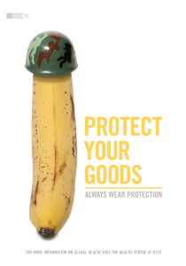


Kristen Oaxaca, Senior Graphic Designer
Filed under: Branding, Design | Tags: branding, design, graphic design, King Edward VII's Hospital, logo, Logo Redesign, London, Royal
King Edward VII’s Hosptial in London recently began rolling out its new logo. The Hospital, which is the hospital of choice for Her Majesty The Queen as well as many of the other members of the royal family (ech emmm Prince William and Kate Middleton), wanted a fresh logo because “the old logo was tired, was difficult to use and really didn’t reflect the Hospital’s reputation.” (logo-designer.co) The old logo consisted of King Edward VII’s cipher in an oval badge.


Offthetopofmyhead was chosen for the logo redesign. Their job was to keep the Hospital’s heritage and traditional values while reflecting the evolution of the hospital and its state-of-the-art facilities. Offthetopofmyhead’s founder and creative director explained, “King Edward VII’s cipher has been the hospital’s logo for around 100 years. It’s a massively valuable asset because no one else can use it and its graphic individuality distinguishes it from all its competitors.”
The new logo for the Hospital keeps the equity of the old brand and gives it a fresh, new look. The oval has been removed, the emblem itself has been redrawn and modernized (as well as colorized), and a custom, more modern san serif font has been created for the Hospital’s name.


Kristen Oaxaca, Senior Graphic Designer
Filed under: Design | Tags: Deutsch LA, graphic design, logo, Logo Redesign, pizza hut, rebrand

As sales drop and rivals pull ahead, Pizza Hut rolls out a new logo and revamps their identity. Pizza Hut recently hired Deutsch LA to help them in their quest to rebrand. They examined the brand’s previous logos and, although their new logo seems a bit flat compared to those in the past, one familiar object is still present–the roof.
“We’ve got a lot of equity in that roof,” Drinkwater, Pizza Hut’s VP of national marketing, says.
The font will also stay consistent with Pizza Hut’s previous logo, but the color will disappear and the logo will simply be reversed out of a red “saucy” circle.

MY REACTION: I think Pizza Hut just lost its pizzaz. The new logo looks flat and reminds me of the Sauce logo… another pizza place. I’m interested to see how they use this new logo and if the rebrand actually works, but as of now… I’m not a believer.
Kristen Oaxaca, Graphic Designer
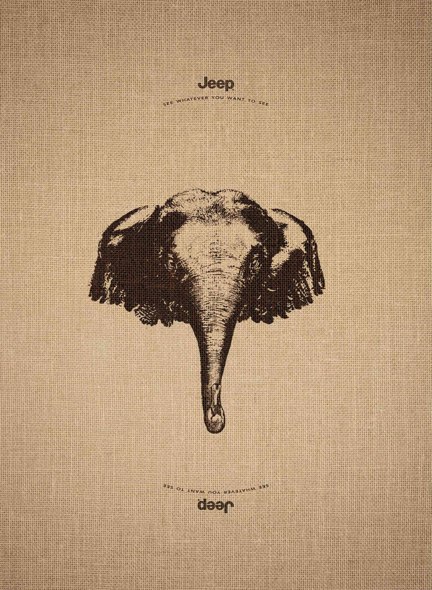
Filed under: Design | Tags: Ad, advertising, Campaign, design, graphic design, Jeep, Leo Burnett, Optical Illusion
As designers, we’re always looking for different ways to see things… we want to be the one that sees something differently and shows it to the world. In one of their recent ad campaigns for Jeep, Leo Burnett France did just that.
In this campaign, Leo Burnett France created 3 optical illusions that can be seen when you turn the advertisement over. Now, this wasn’t just a cool optical illusion to include in the advertisement… it actually supported their entire concept.
On their website, Leo Burnett France said, “When one is the happy owner of a Jeep, we know that at any time we can go where we want to, see what we want to see.” This idea is reinforced in the advertisements because the viewer is welcome to see whatever they want to see… a giraffe or a penguin; an elephant or a swan, etc.
What do you see?


Kristen Oaxaca, Graphic Designer
