Filed under: Uncategorized
Begin evaluating every corporate task, policy and strategy relative to the actual amount of benefit the customer will receive. If an action does not directly benefit your customer, why are you doing it?
This is another way of measuring whether you should do something at all. If reorganizing the telephone staffing actually benefits the customer calling in, then do it. But if it only benefits the internal perception of the operations department, why are you wasting effort, time, and precious resources on an activity that produces no benefit for the customer.
Always ask yourself; if I were a customer would I see this as a tangible benefit valuable enough to for me to invest my time and money in? If so, then it might be an avenue to explore, but if it doesn’t even motivate you to an action, why would it stimulate a customer to part with their money?
Katrina Noble
Media Director
Filed under: Design | Tags: branding, Color Psychology, design, graphic design, logo design
As a designer, I am often faced with the dilemma of which colors to use in my designs. I don’t want to use or not use a color strictly because I have a certain like or dislike for it… I want to choose a color that will help get a message across, that will help brand my client.
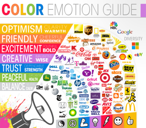
Color conveys meaning to us whether we are aware of it or not. Sometimes color can hold certain meanings for us based on our personal taste, but most often color holds meanings based on how they are viewed and portrayed within our culture. For example, in the United States, black is the color most often associated with death and mourning whereas in India, the color that represents death is white.
Color is important in all aspects of design, but the place where it is most important is in logo design. A company’s logo is most often the first thing the consumer faces when introduced to a brand… it’s the first imipression and you want it to be a good one. Here are some helpful tips for choosing the right colors for your next logo…
RED:
• Passion, Energy, Danger, Aggression, Stimulates Appetite
ORANGE:
• Innovation, Modern Thinking, Youth, Fun, Approachability
YELLOW:
• Sunny, Warm, Friendly, Stimulates Appetite
• Negative: cowardice, warning
GREEN:
• Natural, Ethical, Growth, Freshness, Finance
BLUE:
• Professionalism, Seriousness, Integrity, Authority, Success
PURPLE:
• Royalty, Luxury, Wisdom, Dignity, Wealth
PINK:
• Fun, Flirty, Feminine
BLACK:
• Power, Sophistication
• Negative: villainy, death
WHITE:
• Purity, Simplicity, Naivete
BROWN:
• Masculine, Rural, Outdoors
Kristen Oaxaca, Graphic Designer
Filed under: Uncategorized
When you make a sale it’s not only important to know who bought it, but also why they bought. What motivated them to buy your product, what motivated them to buy your product over your competitor’s product, and what you can do to motivate them to into a repeat purchase in the future?
Many purchase made involve either saving money or time. If you can include one, or better yet, both of these powerful motivators in your offer, you’re success rate will likely increase.
When people feel like they are saving money they are more inclined to make a purchase immediately rather than delay. Demonstrate that your product or service can save them time, make them more efficient, and allow them to get more business done during the day and you have a winner.
Katrina Noble
Media Director
Filed under: Education
I think the key to effective advertising is how you perceive it, what your goals are and how you adjust your approach. Below are five things that you should consider:
1) Lower your expectations – I can’t tell you how many times I had a potential client tell me that advertising doesn’t work because they ran one ad or a radio spot over a week and didn’t receive any results. Seriously, give your advertising a chance. The objective of your ads should be to move people from awareness to trust to purchase. Relationships take time.
2) Cast narrowly – target your advertising to your best customer, not everyone. If you are purchasing radio don’t buy an 18+ demo, it’s too large….look at your customer base and determine the most likely to purchase your product by age and sex. A yogurt shop by a university is going to most likely attract Females 18-24. If you are doing a Facebook campaign target female college students between the ages of 18-24 that live in your geographic area.
3) Promote content – use your ads to promote something for free. It could be a free eBook, How-To checklist and events that will help your potential customer learn. This type of advertising lends itself to online banner ads. Have a call to action, capture leads and gently (that is the key word) introduce them to your product or services.
4) Measure everything – reviewing analytics and tracking what you do is the only way to determine what is working. Keep monthly tabs on your sales, phone calls, web activity as it relates to your advertising campaign.
5) Test, test, test – If you want to improve your results, you’ll need to look at fine tuning things like the headline, copy, doing a different call to action, switching out pictures, adding additional media to your mix or trying different media altogether.
Advertising is an investment. Make sure you are getting a great return on it!
Katrina Noble
Media Director
Filed under: Design | Tags: 30 Days of Change, brand identity, graphic design, logo design, logo identity, Logo Launch, Yahoo!
Yahoo! has had a renewed sense of purpose and progress and after a year of evolving their brand (included new products for weather, email, photo sharing, and more), they have decided to extend this new spirit of change to their logo.
On August 7th, Yahoo! kicked off what they are calling 30 Days of Change. In an effort to build up to their exciting new logo reveal in September, Yahoo! is displaying a logo variation on their homepage each day for 30 days. Yahoo! says, “It’s our way of having some fun while honoring the legacy of our present logo.”
The new logo, which will be revealed on September 5th, will keep Yahoo!’s famous color purple as well as its iconic exclamation point. To check out the logo variations as the brand leads of to it’s big reveal, visit the Yahoo Tumblr site and see what you think!
Kristen Oaxaca, Graphic Designer
Filed under: Design | Tags: Creative Process, design, graphic design, Inspiration, Mood Board
As a designer, I’m always looking for new ways to be creative and efficient in my work. I’ve been hearing talk of mood boards lately and wondered if it was something that could help me in my own job. After doing a little research, I couldn’t believe that as a designer I’d never used this technique before! So for those of you who, like myself, are novices to the world of mood boards, here is some info that might help you out!


What is a mood board?
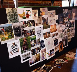
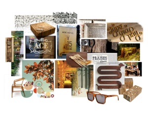
A mood board is a technique used by graphic designers, photographers, interior designers and the like to illustrate the general “feel” that a designer is trying to achieve. Through the use of text, images and samples of object, all carefully arranged on a board, mood boards enable designers to use subliminal visual tricks to make the client “get it.”
Where do I find inspiration?
Just because we use technology for most of our work doesn’t mean we can’t find inspiration elsewhere. So stop searching Google Images and look for inspiration in the real world… books, magazines, nature, etc.
What should I know about mood boards?
- Choose the right format… mood boards can be created online or off, but each requires a very different approach.
- Use one large image… use one large image and build around it with other images and objects that support the main image and answers any questions the client might have about it.
- Save the surprise… don’t show the client ahead of time – if you wait until the meeting to show the client then you can get their honest reactions and not a bunch of preconceived questions.
Need extra tips?
- Practice your mood board skills by creating a small mood board about yourself and share it with co-workers.
- Don’t ignore the power of just a few words… using a few bold words on your board can create drama, tone and meaning.
- Spark an emotional response… real objects are good for doing this. For example, if your project is inspired by the beach, bring in a shell.
- Test your board… if your test audience has too many questions about an object and why it’s on your board, then you might consider if it’s really meant to be there.
Kristen Oaxaca, Graphic Designer


