Filed under: Design | Tags: design, graphic design, Hunger Games, Mockingjay, Movies, Poster, Website
I promise I won’t geek out on you (well, not completely anyway), but when I saw these posters for the upcoming Hunger Games movie, Mockingjay Part 1, I knew I had to share them!
If you follow the books and/or movies, you’ll know that at the end of Catching Fire, the Capitol is in a bit of trouble. With the people of the districts beginning to believe in Katniss and Peta, the Capitol must convince everyone that the way they run things is just fine… no need for change. As a lead-in to the next movie, a website and series of posters has been created to get the audince involved and help to hype up the movie.
Well, I can honestly say that I’m a sucker. It totally worked on me! I checked out the website for the Capitol and it is really well done. In addition to their modern design of it, I love that the creators made the website as if the audience is one of the people from the districts… you can see President Snow in all his glory as well as sign up to watch “Capitol TV”. CLICK HERE TO SEE WEBSITE.
More than the website, I was totally intrigued by the series of posters they released for the movie. Each one features a different district and an unsung “hero” from that district. For one, the photography is great–there is such detail, and each photo alone tells a story. The design of them is also something that I love. The series has a very simplistic design… featuring each district’s number, their symbol as well as a minimal amount of copy. If you look closely, the Capitol’s logo is also featured along with their motto, “Panem today. Panem tomorrow. Panem forever.” This touch makes the posters that much more real… drawing the viewer in as if they are living in this world with the Capitol and all of these districts.
Kristen Oaxaca, Graphic Designer


Filed under: Design | Tags: brand identity, Brand Update, Deaign, graphic design, logo, Logo Redesign, PayPal

PayPal rolled out its new identity and marketing campaign today with the help of Yves Béhar and his Fuseproject team. In its 15 year history, PayPal had only had two different logos. When evaluating PayPal’s current logo and people’s perceptions, Fuseproject found that PayPal ranked high in trust but not so high in innovation. So, as they move toward their future of being more mobile, tech and people friendly, PayPal decided to launch a new identity.
Rather than overhauling the entire look, the Fuseproject team decided to keep much of the brand recognition intact. The result of the makeover was a bolder wordmark with a more modern font, a stranger monogram, more vibrant blues and an angled graphic that reinforces the idea of innovation.

When describing their design, Fuseproject said, “We focused on two key themes for design: connection and forwardness. For connection, we designed a new monogram with an overlapping double P and transparent effect to emphasize human connection. For forwardness, we strengthened the italics that have always been a part of the PayPal logo — harking back to the brand’s heritage, and affirming a forward thinking spirit.”
For more about this brand redesign as well as a video of the creative process, see fuseproject.com
Kristen Oaxaca, Graphic Designer
Filed under: Design | Tags: Comic Sans, design, Design Rules, Fonts, graphic design, Typefaces, typography

As designers, one of the main parts of our job is to pick out the perfect typefaces that will set the mood for our piece, get our message across effectively, appeal to the correct audience, among other thing. Often when I sit down to design something, I either don’t have a typeface in mind at all, or the one I have in mind ends up turning out nothing like what was in my head. This leads to the wasted minutes (sometimes hours) perusing through tons of typefaces trying to find the perfect one (or two). Here are 10 basic “commandments” that will help you narrow down your typeface exploration time!
1. Know your font families: Geometric Sans, Humanist Sans, Old Style, Transitional, Modern and Slab Serif. All these years as a designer and I had NO idea there were this many families!
2. Combine a Sans-Serif font with a Serif font. I do this often… if you find the right ones, they will compliment each other well!
3. The opposite of #2… combine a Serif font with a Sans-Serif font.
4. Don’t combine two fonts that are too similar. You need balance in your designs and choosing two fonts that are too similar won’t create enough contrast in your designs, throwing off your balance.
5. Opposites attract. Choose two fonts that contrast nicely.
6. Two is plenty! Most often, use only one or two fonts in your designs. Using more than that can make your design too hectic. (Though I will admit there is always exceptions!)
7. Don’t ruin the mood. If you combine two different font moods, it will throw off the entire mood of your piece.
8. Compliment. Though you want to avoid using similar fonts (see #4), it’s important to choose fonts with complimentary moods from similar times.
9. Contrast is important! Using contrasting bold and thin fonts often create a unique look.
10. Please avoid the following fonts at all costs: Comic Sans, Papyrus, Curlz, Viner, Kristen and Symbols.
Kristen Oaxaca, Graphic Designer
Filed under: Design | Tags: advertising, April 1, April Fools, Commercials, design, graphic design, Hoax
I have been neglecting the design side of this blog for quite a while, but I am finally back! To get back into the swing of things, I thought I’d pick a fun topic to blog about—April Fools Day! Now, while I was busy pranking my friends this year, advertisers were also being quite mischievous. Here are some of my favorite brand hoaxes from this year…
1. Mr. Dash

2. Fruit of the Loom
3. Moshi
4. WestJet
5. American Beagle Outfitters
6. HeliYUM
7. Dominos

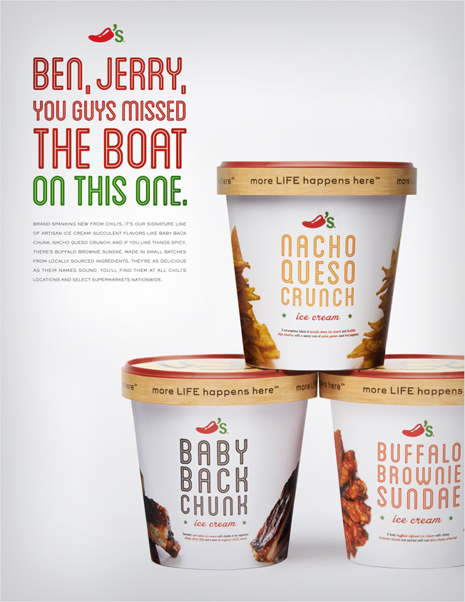
8. Chili’s
9. Rosetta Stone

10. Virgin Active
Kristen Oaxaca, Graphic Designer
Filed under: Design | Tags: design, graphic design, Photograph Work, Photography, Portfolio
Unfortunately, this is the sad truth. I love taking photos wherever I go (and I take tons of them too) but that doesn’t mean I take great photos. This is evident when I try to take photos of my design work – and let’s face it crappy photos of your work make your work look crappy!
Though they won’t help us to become world famous photographers, here are 8 tips to help you photograph your print work in a more professional way:

- Get the Lighting Right: Try photographing your work in a room that gets a lot of natural sunlight. If you need to ad extra light, use “daylight bulbs.” In addition, don’t be afraid to use more than one light or move your light around do create the perfect shadows.

- Choose the Background: You may decide to get daring and use color backgrounds for your photos. If you do, make sure to choose colors to compliment not distract from your work. If all else fails, use white… it’s easy on the eye and less distracting than other colors.

- Use a Tripod: Though this is a pretty simple tip, it’s also very important. You’re hand will never be as stead or reliable as a tripod to take sharp, crisp photos.

- Pick the Perfect Position: If you wanted your pieces to be displayed flat, you would have just mocked them up in Photoshop. Use this opportunity to show your work in a different way… prop it up, view it from above or maybe at an angle.

- Find Your Focus: To make your photos more dramatic, pick a certain part to focus on. Bring that item to the fromt and soften the background items (WARNING: Don’t soften too much… it defeats the purpose of showing off your work!).


- Decide to Bleed (or Not): More than likely your first instinct will be to contain your entire piece of work in the photograph. This isn’t always the best choice though. Making your items bleed outside the photo can make for a more dramatic image – try coming in close with your camera rather than cropping later in Photoshop.

- Repeat: Don’t be afraid to show more than one of the same item in your photograph. Repeating the same piece of work only intensifies the impact.

- Less is More: Even if you’re photographing an entire campaign, don’t include too many pieces in one photograph. This will cause you to back up with your camera just to fit everything in and will make for a more busy, less impressive photo.
Kristen Oaxaca, Graphic Designer
Filed under: Design | Tags: design, Google Fonts, graphic design, Web Design, Web Fonts, Web Safe, Website

As a designer in an advertising agency, much of my design skills are focused on print advertisements. However, I am in the beginning stages of a website redesign―my first website since being out of school. That being said, my web knowledge is a bit rusty.
As I began brainstorming for the site design and researching about web trends, I came across a bit of information that was VERY helpful. Though it was only 4 years ago when I was in school, I was taught about “web safe fonts” and how if I wanted to use anything more “fancy” I would have to use it as an image… which isn’t exactly helpful for users searching for your site or SEO.
This bit of information that was so helpful to me was the concept of Google fonts. Now, if you are heavy into web designing then you’re probably thinking this is old news… that may be true, but I wanted to post this as a helpful tip for others (like me) who have been out of the web loop for a while.
So, what is Google fonts?
Google fonts is a directory of fonts released under open source licenses. (English translation: you are free to use these fonts on any commercial or non-commercial project.) It was created to allow developers to use high-quality fonts on their websites.
How does it work?
Rather than relying on fonts installed on the website user’s computer, these fonts are stored on Google’s servers. That means that when you use these fonts on your website, it accesses Google’s servers to display the font on the user’s screen (just as your website accesses your web server to display images on your site).
To use these fonts:
- Go to google.com/fonts
- Choose the fonts you want to use and “Add to Collection”
- Select “Use” and copy the link into your HTML
- Add to the font by using CSS
Can I download these fonts onto my computer?
Yes, you can download these fonts using the “Download your Collection” button. This will allow you to design with these fonts in Photoshop (or the like) as you design your web pages.
What browsers are Google fonts compatible with?
- Google Chrome: version 4.249.4+
- Mozilla Firefox: version: 3.5+
- Apple Safari: version 3.1+
- Opera: version 10.5+
- Microsoft Internet Explorer: version 6+
Will Google fonts work on mobile devices?
Google fonts work on most mobile operating systems, including Android 2.2+ and iOS 4.2+ (iPhone, iPad).
Kristen Oaxaca, Graphic Designer
Filed under: Design | Tags: 2014, creativity, designer, graphic design, new year's, resolutions

Every time a new year rolls around we hear about the resolutions people are making. “I’m going to be healthier!” “I’m going to be more organized!” Nine times out of ten, these resolutions don’t make it to February. I’m not judging… I’ll be the first to admit I’m not the best at sticking to New Year’s resolutions.
This year, I thought I might try something new when making my resolutions. Instead of focusing on personal matters, I’ve decided to focus on my graphic design side. I’ve compiled a list of great New Year’s resolutions for graphic designers for 2014. It’s probably not a realistic goal to accomplish all of these in a year, but if one or two grab your fancy, then give them a shot!
1. UPDATE YOUR PORTFOLIO – You know it’s been sitting there collecting dust all year. Drag it out and update it with your amazing work… you never know when you might need it!
2. TRY A TUTORIAL – No matter how much you know, there’s always something out there to learn! Maybe you try a Photoshop or Illustrator tutorial… or stretch out of your comfort zone and try something that’s a bit more artsy. Maybe a paining tutorial?
3. GET OUT – Inspiration can come from anywhere, but it can’t come from the same place forever. Get out of your office or your house… go explore a park or a new place. It may spark some interesting and creative ideas!
4. NETWORK – Whether you’re meeting new people face-to-face or you’re on a social media site or blog, networking can do great things for your business. You never know where you might meet your next client… so go get your name out there!
5. TAKE RISKS – Don’t be afraid to run with an idea that might be a little off the wall. Sometimes it pays to be different… just make sure you’re still meeting your client’s needs.
6. BE PUNCTUAL – Always meet or beat your deadlines. Even if they client seems “ok” with you being late every now and then, it will leave a better impression if you get them what they need when they actually want it.
7. BLOG – Whether you start a new blog or just pay more attention to your current one, blogging is a way to help get you thinking. It opens your mind to work other than your own, gets you thinking both critically and creatively and gives you a place to showcase your work and get feedback on a regular basis.
8. BE CREATIVE – Yes, as graphic designers we’re creative day in and day out. Try expanding your horizons though… find a new creative outlet that you enjoy – painting, jewelry making, crafting, etc.
Happy New Year!
Kristen Oaxaca, Graphic Designer
Filed under: Design | Tags: design, graphic design, Infographic, Thanksgiving, Turkey Day
As the holiday season quickly approaches, people are busy buying food, making their Black Friday plans and writing their lists to Santa. In the midst of all the chaos, we musn’t forget the holiday that reminds us to be thankful for all that we have – Thanksgiving. With Turkey Day just a few days away, I thought I would share with you some fun facts about the holiday with this creative infographic!
Happy Thanksgiving from the staff at BolchalkFReY!

Kristen Oaxaca, Graphic Designer
Filed under: Design | Tags: advertising, Boston Red Sox, graphic design, Sports Traditions, St. Louis Cardinals
Amongst all the rivalries and hard core fans, sports teams show their appreciation for other teams in an unconventional way… through advertising. Just last week, the Boston Red Sox won the World Series. There were tough games and hard losses, but after all was said and done (and the city of Boston celebrated, of course), Boston showed that they were a class act by taking out a full-page ad in the St. Louis Post-Dispatch. In this ad, there was no trash talking and no need to gloat… Boston simply said thank you to the St. Louis Cardinals and the city of St. Louis.

I find this to be a very classy move and am shocked to find out that it is actually a tradition in sports. Back in June, the Chicago Blackhawks showed the same appreciation for the city of Boston after they beat the Boston Bruins in the Stanley Cup. In addition, the Chicago Tribune showed their support for Boston after the Boston Marathon bombings with the following full-page ad. It’s good to know that with all the trash talking in both sports and in the advertising world itself, ad space can still be used in such a positive way.

Kristen Oaxaca, Graphic Designer (Go Sox!)
Filed under: Design | Tags: design, Design Portfolio, graphic design, Online Portfolio, Portfolio, Website

Last week, I shared some tips with you about how to create the perfect design portfolio… this week I want to continue in our portfolio discussion, except for I’d like to focus on those daunting online portfolios! Here are some tips for creating a first class online portfolio that will impress future employers.
1. Choose Your Platform
Whether you’re a “web savvy” or not, there are plenty of options out there for you to choose from when it comes to your online portfolio. You’ll nned to get a domain name, hosting and set up a site… if that all sounds too overwhelming, there are plenty of sites out there that will do it for you! Here are a few hosting sites that can help you out!
2. Be Selective
Just like with your physical portfolio, you don’t need to show everything you’ve ever designed. Be selective and only show off your best work.
3. Organize
Don’t just post your work in any old order… make sure you think about how your pieces flow and how they’re working in the order the viewer will see them in. Just as in your physical portfolio, your online portfolio tells a story, make sure your story flows smoothly and has a nice rhythm.
4. Update
I know it’s easy to forget about your online portfolio out there in cyber space, but don’t let it become low on your priority list. Keep it updated… you won’t impress anyone with a portfolio that hasn’t been updated in years!
5. Photograph Your Work
Displaying printed work online is always a challenge. You can post a digital version of your printed work, but taking a photograph in its actual printed form will do your work more justice.
6. Easy Navigation
With short attentions spans now days, you need an online portfolio that’s going to get people’s attention quick and that’s easy to navigate through.
- Keep your design and layout simple.
- Make the design of your site unique, something that will make your site stand out.
- Have easy to find contact info – you want to make sure the people viewing your site know how to email you, follow you on Twitter, etc.
- Consider including a “Hire Me” button… you don’t want there to be any question that you want people to hire you.
With tips for creating both a fantastic physical and online portfolio, you now have no excuse not to get that job you’ve always wanted. Good luck!
Kristen Oaxaca, Graphic Designer
